A race-week planning desk: split board, real app surfaces, direct store links.
Design competition
Four different landing-page directions.
The goal is not four skins on the same layout. Each direction uses a different visual argument for the same app: structured running plans, daily briefs, race predictions, HealthKit, and Strava context.
An understated runner diary for people coming from notebooks and spreadsheet tabs.
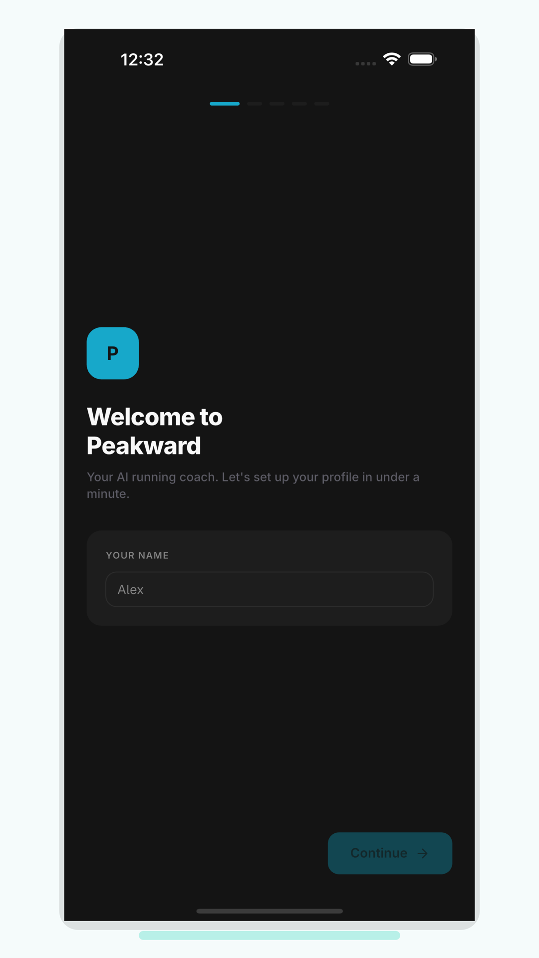
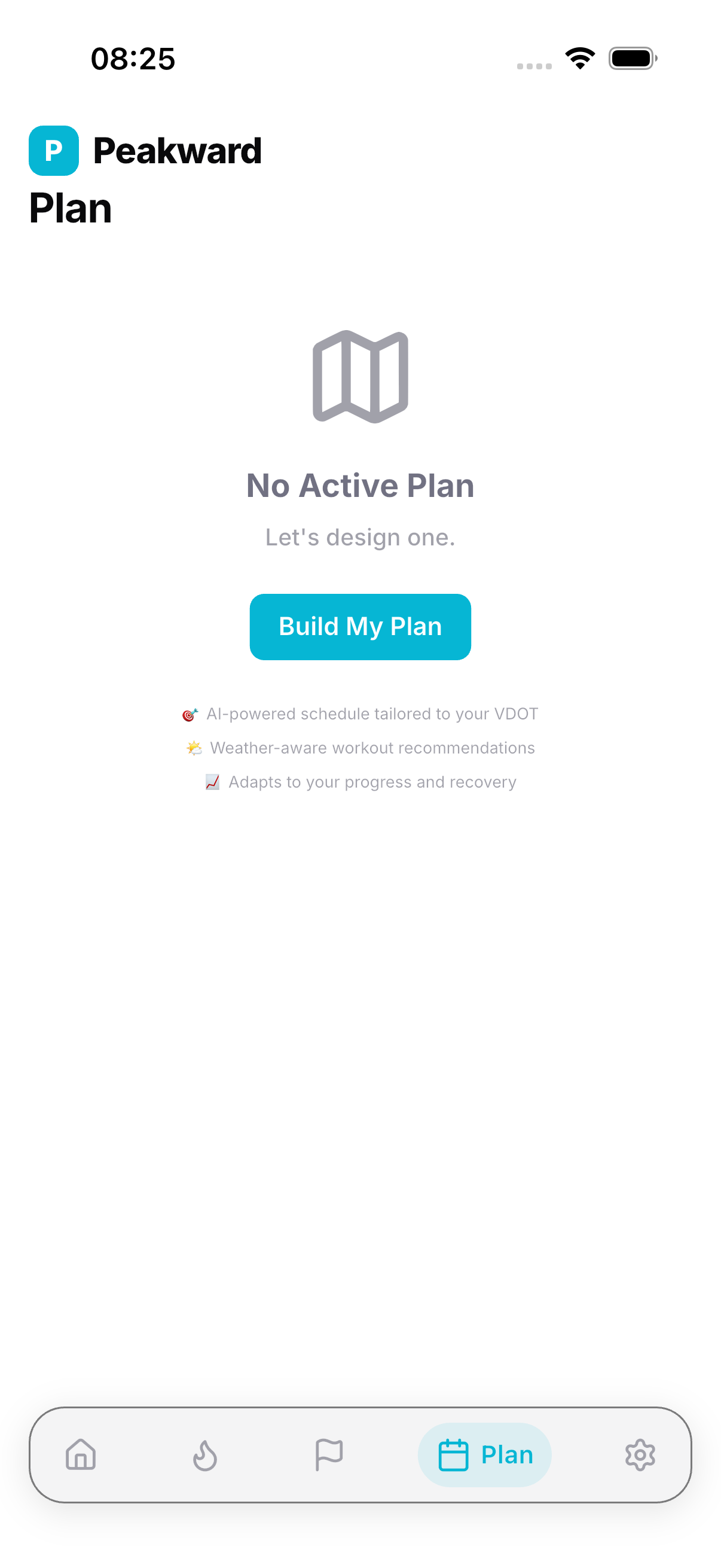
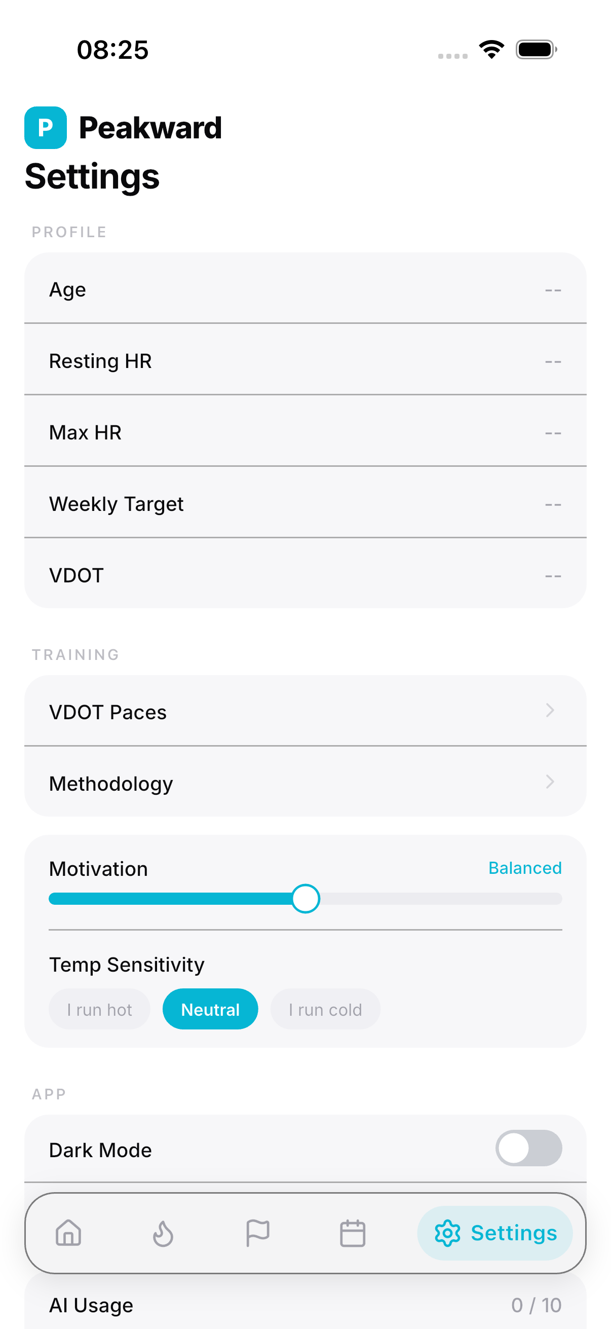
A darker performance console with pace math, thresholds, and training signals.
A tactile map-fold direction where screenshots behave like route panels.
Decision
Paceboard wins for launch.
It says what the app does fastest: turns running context into an actual week. It is product-led, quieter than a marketing-heavy page, and gives the first screen its own visual system.